top of page
Decoding Ola and Uber for the Elderly

Let me clarify first what I mean by Elderly: Age group 55 plus
Business Side:
Let us first check why Ola or Uber should focus on the Elderly. Currently, if go through statistics of the total users only 8 to 9 % are Elderly which is 55 plus age group. So if Ola or Uber want to continue their growth it makes much more sense rather than have a blood bath for existing customers they can focus on the Elderly. As from Macro trends as years and decade pass by population share of the elderly will be increasing. If we take India currently the elderly population is at 10% of the total which will double in the coming decades. So it makes sense through Macro trends also to focus on the Elderly.
User Side:
User attribute:
1. Safety conscious
2. Suspicious of fare
3. Simplicity
Sign Up & Profile creation:
1. Profile creation
2. How the App works or what button does what
3. Setting up the payment options
Landing Page:
1. It is too cluttered.
2. There are no simple directions for booking
Booking Cab:
1. There are too many steps to booking
2. Waiting time is more
3. Cancellation
4. Anxiety between booking and arrival
5. Confusion about payment mode
6. Fare suspicion
7. Trust of the driver who is coming
Ride:
1. Safety — Rash driving
2. Hard time to trust the driver
3. Small talk so that they can trust the driver
4. Driver using mobile while driving.
5. The driver is taking the long route
Payment ride closure:
1. Driver forcing cash or online payment on his account
2. Driver misguiding by saying payment not received online
Prioritization:
1. Profile creation and How App works
2. Landing page simplicity
3. Many steps for Booking
4. Fare suspicion
Solution Space:
1. Sign Up & Profile Creation:
2. If you have gone through the sign-up process of Uber there are 3 things it asks to do as a user: Enter the mobile number and it is verified through OTP, Payment method setup and Promo code.
3. The current flow is simple but there is a need to change it for the Elderly. What can be changed:
4. Sign up: It should be only done through OTP and after which there can be 2 options: Contact a loved one to ask for help setting profile or take help from an Uber customer support representative.
5. Profile creation: It should contain mainly two things
1. Payment method, 2. To add saved address
How the App works:
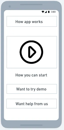
1. After signing up there can be either a short tour or short videos which will help them get acquainted with the app.
2. There can be also a section where a user can create demo trips and also set up payment methods and pay using various payment methods
3. This will help the elderly to trust the app and will remove the fear that what will happen if I press this button. Which will increase the engagement and usage of the app.
Landing page simplicity:
1. Currently landing page is too cluttered and there is a need to revamp it for the elderly to make it simple and actionable for them.
2. There are again two things that should be clearly mentioned:
1. Payment method and balance, 2.Saved address
Many Steps for booking:
1. Currently if you go into setting Uber app there is a section for saved places where you can save work, home, or other places.
2. The only change that is required is we have to take the same and add it to the landing page. With prominent boxes where previous addresses are saved. You can check the landing page screen and also address the addition screen
3. In saved places we need to add: 1.Contact information to whom they are going, 2. Vehicle type through which they will prefer, 3. Address
4. For booking Elderly only have to tap on the box from saved places the fare will be visible and they can book the ride directly according to the vehicle saved.
5. Why this will work if we observe the elderly mostly will be going to relatives or friends or religious places or some kind of pre-defined place for the majority of the time.
6. This one-tap booking will not only ease the process but also will increase trust while booking an online ride.
Fare suspicious:
1. At the time of booking the fare which will be shown can be compared with the fare if they go for the same ride offline.
2. If a rickshaw for the same route charges says 100rs then the comparison should be shown at the time of booking that the offline rickshaw will charge 100rs and we are either charging 100 or 90rs.
3. This will increase their trust in the fare and will not doublethink going through an offline ride. Simply giving visibility can also solve problems.
Conclusion:
1. Even if such apps are made for self-sustenance there is a need to have a demo and hands-on experience to remove the anxiety and fear of what will happen.
2. Simplicity and remaining core to the value is important sometimes we tend to develop a solution that can solve everything but end up solving nothing.


bottom of page